
|
||||||


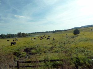
The Lure of the Country... September 25, 2013 ...is undeniably strong this time of year, and the Commonwealth of Virginia has some of the most beautiful scenery I've ever seen. As soon as I get past the last of the suburban developments, I start to breathe easier and more deeply, and my spirits rise. Of course I love the convenience of being near major shopping destinations, too, but every Fall I just want to get into the car and head west. The show at Berkley is coming up soon, and I've got to deliver the paintings one day next week. That'll give me an opportunity to visit a winery on the way back, and get a few more reference photos for vineyard paintings. We've gone to two recently, and the countryside surrounding the facilities has been gorgeous. At right, a grab shot from the car window. |
 |
Ooops, I mean, Polyester September 14, 2013 On closer inspection, the new material is polyester, not acetate, and it also goes by the name Mylar. It's archival, which is very important, and it won't tear or discolor. I've been thinking about new ways to create art using it, and am very excited about the possibilities. Also: it turns out that picking up the pastel pencil was not such a bad idea. I don't like the way the wax in the colored pencils gums up and forms tiny balls. |
 |
Acetate September 11, 2013 The acetate pad arrived today. It was just in time; yesterday, I'd finally screwed up the courage to approach a gallery in New England about representation, and had sent off a query email with 5 attached photos of my work. Have heard NOTHING. Nada. Zip. I know it's way too soon to feel cast off, but I've been feeling miserable anyway. Just because I wasn't miserable enough, I decided to check out galleries in New York that show realist work. Of course, the artists in those galleries are brilliant, and when I compared my work to theirs, I felt humbled. So I was completely down in the dumps, getting into one of those bad, bad, downward spirals--- and then the acetate arrived. A couple of days ago I'd learned about double-sided frosted acetate and how to use it for fine art, and it seemed like a natural fit: I love drawing, and the idea of creating pieces that have a smoky sort of mysterious, dream-like imagery really appealed to me. So I picked up the first sheet of acetate and (stupidly) a pastel pencil (should have been a regular colored pencil, or at least graphite) and went at it. I drew a contour drawing from a model I'd photographed several weeks ago, and it looks just *fine*. All is right with the world again! This could lead to some interesting new directions. I'll post some images soon. |
|
This and That August 14, 2013 The last couple of weeks have been good ones in terms of work; I haven't had to go anywhere or be distracted with visitors, so I've put in plenty of solid painting time. Much has been accomplished. In the next month, I expect to finish a few pieces and then start on some new ones in the Saturday Night and Light Changed series. Over the weekend, I was able to conduct a photo shoot of two lovely young women who posed for the Air series, so as soon as I get a few things out of the way I'll be able to start a couple more of those. Right now I have one in progress, not on the website yet; I need to decide on a format for the series as a whole (square? rectangular? a combination?) and figure out what the backgrounds should look like. In any case, it looks pretty exciting for the work schedule for the rest of the year. Sometimes lately I feel like I'm near or at the top of my game. The paint flows smoothly, the color decisions seem to work, and I enjoy the challenges inherent in each piece. |
|
Not Much To Report August 8, 2013 Finally dragged myself out of the slump I was in; have been painting like mad for the last few weeks, and it's going well. |
|
Changing Direction June 29, 2013 Something has changed in my brain lately...I've spent the last six to eight weeks in a kind of sulk, not wanting to go into the basement studio now that its main natural light source has been cut off, due to an attempt to stem the water-leaking problem (a problem that was actually caused by clogged gutters, BTW) by building a hideously ugly retaining wall around the window well. So I began sneaking stuff upstairs that I could work on at night (the grisailles) and making a 90-degree turn to pastels instead of my beloved oils. The pastels seem to have loosened my style up, since the detail in them can't be as tightly controlled as with paint. The two paintings I've worked on in the last week or so reflect that looseness, and it feels very natural. I really like what's happening with the oil version of Waiting For Her Shift to End, and am looking for similar subject matter that can be handled loosely. Meanwhile, I continue to develop the little grisaille/Polaroid series, which is as tight as tight can be, especially with the use of the magnifier. But what to do about the studio? |
 |
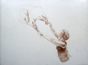
An Aha! Moment May 19, 2013 If you are committed to realism, as I am, and are working in a small format (the 9" x 11" grisailles, for example), you'll find it extremely difficult to paint tiny details. In Yuki Meets Alex, the open-mouthed expression on Yuki's face as she comes to a sudden encounter with a Calder mobile hanging in an airy stairwell at the Museum of Modern Art is key to the painting. I've been having a lot of trouble with it, evident in the prior iterations that you can see if you click on the images on the Works in Progress page. But then one of my artist friends mentioned magnifiers--- the kind of headpiece you wear in a workshop, that have special lenses that allow you to see things close-up. And I found a reference to them in another artist's Facebook comments. So I decided to try a pair. Mine arrived yesterday and I have to say how thrilled I am to finally be able to get things right! Being able to paint tiny details makes all the difference in the world. |
 |
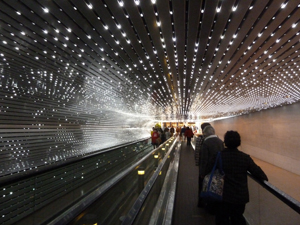
Pre-Raphaelites! May 5, 2013 S.M. and I--- both realists--- started planning to take in the Pre-Raphaelite show at the National Gallery as soon as we found out about it, but it wasn't until both our schedules cleared that we were able to actually get there last Friday. Once the logistics of parking had been worked out, we wandered into the cool elegance of the museum and entered the exhibit. It was a wonderful show. The last time (I think) that I'd seen the Pre-Rapahelites was at the Tate in London, where they were installed high up on a wall, inaccessible and remote. At the NatG, though, we were able to get up really close to scrutinize them. We looked at the modeling, the contours, the details, and S. remarked that the underpainting was clearly visible in many of them. We both paint thin, so that was a revelation for us. In art school, I couldn't afford too much in the way of art supplies, so I learned to stretch the paint and keep it thin. I've never been comfortable with impasto; the one painting I've done in an alfresco style, a bunch of daffodils, I consider a failure. Anyway, looking at the off-handed treatment of the underpaintings makes me think I might be able to do the same--- where it's justifiable, that is. Luckily for us, the Durer exhibit was going on in the East Building. We trotted over there after lunch and started the tour. I've never been a fan of Durer before now, but that's because I've never seen any of his original work, only reproductions. The engravings are beyond belief. We were stunned: how is it possible for a human being to do the infinite detail that he did? How could he scratch those fine lines in as closely and perfectly as that? All in all, the day was a great treat, and the weather (though a bit cool) couldn't have been finer. We couldn't take pictures in either exhibit, so I'm adding one at right of the insanely great installation on the moving walkway between the East and West Buildings. At right: Leo Villareal: Multiverse, 2008 |
 |
A Pastel May 4, 2013 I like looking at P.T.'s little painting (see image at right) and have been inspired by both its serenity and the casual, confident way she has of putting down strokes. I find it very hard to do that, but lately have been wondering if I trying my hand at pastel might loosen me up. I found an image that I'd taken from the train on one of my cross-continent trips, and decided to experiment. I've had several boxed assortments of pastels sitting around for a couple of decades, and they include rounded, really soft colors, and harder ones in rectangular stick form. They're all really difficult for me to handle because I can't get the control I like over line and shape, but I used the shot-from-the-train image to create a little 9" x 12" piece on toned paper. Of course, the color's outrageous, nothing like P.T.'s subtle, understated stuff, but it's completely faithful to the original image, which was shot as the rising sun lit the cornfield around the tree with an orange glow. The sky was clear and blue, as were the long shadows on the foreground. |
 |
| I'm reasonably happy with it, though it needs to be finished. There should be trees on the distant horizon, and the trunk and limbs of the tree need to be drawn in. | 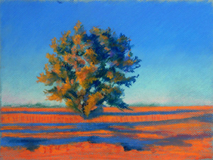 |
Impatience April 27, 2013 Painting the grisailles is tedious work. Picture this: a black and white photo, very large; over it, you place pieces of tinted glass cut to fit exactly over various parts of the image. Let's say the photo is of a still life that includes an orange, an apple, and a lemon. Pieces of yellow tinted glass have been cut to fit over the orange; first you place one, then another. The second piece makes the color more intense, yes? Now you place a piece of red glass over the two yellows, and the result is a beautiful, deep orange color. Of course, you could put the glass pieces on in any order you wished, and even start with the red...It all depends on what you want the final result to look like. Here's the thing: because the glass is transparent, whatever you have as the base is going to show through. If you want the orange to look real in a painting, you'll have to paint in, in grey values, the texture, the bumpiness of the orange peel, before you start laying down those glazes. The glazes simulate those pieces of cut glass we were referring to earlier. What's so remarkable about using this glazing technique (and the old masters used it to great advantage) is that you get a spectacular depth and richness of color. Light goes through the glazes and bounces back from the base, mixing optically. My usual technique in painting is to "go at it" with fairly flat, fairly opaque color from the get-go. I might have an underpainting of a color I want to show through the top layers, but it'll be far more subtle than with a glaze. So, what's my current problem? Trying to eliminate streakiness in areas that are meant to be flat in the final work. Trying to define surfaces so they'll "read" correctly once the glazes are applied. In other words, the grisaille has to be a perfect representation of what the final needs to look like. And I just can't wait to get to that stage that begins to produce luscious, jewel-like color. But I have to be patient and do the groundwork first. |
 |
A Monkey Wrench in the Works April 18, 2013 Got a phone call late this afternoon from someone representing the Ratner; apparently, they have canceled all of the upcoming local artists' shows for renovation or something like that. Aside from the obvious consequences for me--- now I don't have a single show coming up this year or next--- I'm really sorry to hear this; the Ratner was a wonderful showcase for talent in the DMV area, and it's a loss for art patrons as well. I've seen beautiful work in many different mediums at the museum, and it's been a great place for artists who are starting out to display their work. So, now what? I have the grisailles but no place to show them (I was even working on one when I got the call). Had lunch with P.C. today, and it was wonderful. She's easy to talk with and we have a good time sharing information and ideas about everything from art to family to culture and politics. And it took my mind off the recent tragedy in Boston. |
|
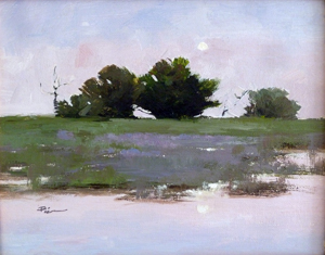
Telephones April 17, 2013 It's been a while since I had the courage to go back in and work on the large areas on the Yellow Telephones painting; those big spaces require me to have a couple of hours of dedicated, uninterrupted time to focus on the careful gradations that take place across them. The last two days have provided that time, so I just jumped back in. It went a lot more easily than I would have thought. P.T. arrived for a lunchtime visit last week, bringing one of her gorgeous landscapes with her. We had a good time chatting on the porch and planning our next big moves. I'd gotten one of my own landscapes back from a gallery a couple of weeks ago, and had hung it up because I thought it was pretty good; next to her poetic little beauty, though, it pales in comparison. I might try to work from that foggy, misty photo of a pond out in the country that I took in February and soften my strokes. |
|
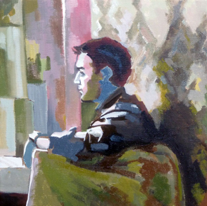
Getting Back in Gear April 5, 2013 Things are getting back to normal, albeit slowly. Taking a month off from painting puts your head in a whole other place; I haven't thought about art in so long I'm having trouble remembering where I left off and what needs to be done next. When I'm working on art full time, I look at the world differently. I get ideas. Being tied instead to domestic chores makes me feel dull and listless. Today I picked up on Three Women at the MFA; it was begging to be worked on once I noticed that the scalp of the woman on the far right was showing through her silvery hair; also, the hair has a touch of wheat color in the reference photo that I'd missed. And I wanted to change her sweater color to the lovely periwinkle that shows up in one of the adjusted photos--- it works to balance the darker plum color in the wall panel on the left side, and makes it look like she's the one with the insights; the other two women are wearing black or navy. I'm making a list of the paintings that I want to start this calendar year. |
|
Little Jewels, and Back to the Studio! March 25, 2013 The Ratner series is coming along much better now that I've made the decision to do the underpainting in oil. I'm quite excited about getting to the next phase, which is the glazing process. Layering tints of color should produce a jewel-like finish, with depth and interest. I've gone through my photo archives and found a few more images that should work nicely in this set, and started marking off the format size and the grid, then taping the areas that I want to keep clean. Finally, I'm beginning to see my way clear to getting the house fix-up done, and today I got back into the studio for the first time since February 27th (I work on the Ratner series upstairs at night). I finished the third painting in the Skaters series, and worked on three others. Feeling a sense of relief. |
|
Absent March 21, 2013 Recent events have made it necessary for me to drop everything and work on the house. I've washed curtains, vacuumed, painted rooms, sanded the kitchen butcher block island, scraped wallpaper, and just generally done a whole lot of scubbing. It's been 3 weeks of this. Enough said. A.B. called today, and we talked for an hour, all about art, illustration, teaching, upcoming shows, family life, etc. As we were saying goodbye, he said, "Go paint, Sue." I figured he was right; did a little more sanding, put the sander down, and went back to the two little paintings I started last month for the Ratner show. It's nice to have a friend validate your need to work; it's like a benediction. The paintings have been a problem, anyway, so maybe it's not so bad that I had a break from them. The plan was to--- as previously mentioned--- do the underpainting in acrylic, because it's supposed to be such a time saver. OK; here's what I think about acrylic: it feels unnatural. It feels like plastic. The strokes I make with it get streaky, and they dry before I get a chance to go back and refine them. Acrylic paint doesn't like to work with the brush. The whole point of art making is to communicate, but with acrylic, I feel as though I have no control over the process, I'm just along for the ride. I was completely miserable about the way the paintings were developing. So this afternoon I picked up on the two little pieces again and went over them in oil, 'cause the rule is, you can paint oil over acrylic, but you can't paint acrylic over oil. The results are much, much better, so even though drying time will take longer, I won't be wasting time painting the same areas over and over again in an effort to eliminate the streakiness. The paint flows sensuously from the brush. It holds a line. I'm happy. |
|